| Submission Procedure |
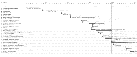
Tube Map Visualization: Evaluation of a Novel Knowledge Visualization Application for the Transfer of Knowledge in Long-Term ProjectsRemo Aslak Burkhard Michael Meier Abstract: This article introduces two theoretical concepts for the emerging field Knowledge Visualization and discusses a new visualization application that was used to communicate a long-term project to various stakeholders in an organization. First, we introduce a theoretical framework and a model for Knowledge Visualization. The framework and the model identify and relate the key-aspects for successful Knowledge Visualization applications. Next, we present an evaluation of an implemented Knowledge Visualization application: The Tube Map Visualization. A quality development process had to be established in an education centre for health care professions. Traditional project plans, flyers, and mails did not manage to get the attention, did present overview and detail insufficiently, and did not motivate the employees for actions. Because Visual Metaphors are effective for Knowledge Communication we developed a customized Knowledge Map based on the tube system metaphor. The Tube Map Visualization illustrates the whole project, where each tube line represents a target group and each station a milestone. The visualization was printed as a poster and displayed at prominent locations in the organization. The findings of an evaluation indicate that the Tube Map Visualization is a powerful metaphor to communicate a complex project to different target groups and to build up a mutual story. The employees considered it useful because it provides overview and detailed information in one image and because it initiates discussion. The Tube Map Visualization is therefore helpful to complement traditional project plans of (1) long-term projects where (2) different stakeholders are involved. The theoretical framework, the model, and the findings have implications for researchers in the fields of Knowledge Management, Knowledge Visualization, Information Visualization, and Communication Sciences. Keywords: knowledge visualization, information visualization, visual metaphor, storytelling, knowledge communication, project management 1 IntroductionThis article introduces two theoretical concepts for the emerging field Knowledge Visualization and discusses a new visualization application that was used to communicate a long-term project to various stakeholders in an organization. First, we introduce a theoretical framework and a model for Knowledge Visualization. The framework and the model identify and relate the key-aspects for successful Knowledge Visualization applications. Next, we present an evaluation of an implemented Knowledge Visualization application: The Tube Map Visualization. Page 473 Visual representations can be used for Knowledge Management processes, i.e., for the identification, transfer, creation, and application of knowledge. Knowledge Visualization is a new field of research which examines our innate potential to effectively process visual representations in knowledge intense tasks. Knowledge Visualization integrates results from different fields, such as Information Visualization [Bertin, 1974; Card et al., 1999; Chen, 1999; Ware, 2000], Cognitive Art [Horn, 1998], Communication Sciences [Fiske, 1982], Information Architecture [Wurman, 1996], and Knowledge Management [Alavi and Leidner, 2001]. Knowledge Visualization examines the use of visual representations to improve the transfer and creation of knowledge between at least two people [Burkhard, 2004; Burkhard, 2005; Eppler and Burkhard, 2005]. Knowledge Visualization thus designates all graphic means that can be used to construct and convey complex insights. Beyond the mere transport of facts, Knowledge Visualization aims to transfer insights, experiences, attitudes, values, expectations, perspectives, opinions, and predictions. And this in a way that enables someone else to re-construct, remember, and apply this knowledge correctly. According to Eppler and [Burkhard 2005] six formats can be distinguished in Knowledge Visualization: Heuristic Sketches, Conceptual Diagrams, Visual Metaphors, Knowledge Animations, Knowledge Maps, Domain Structures. This article uses the format Knowledge Map and integrates the potential of Visual Metaphors for the communication of knowledge. Knowledge Maps use cartographic conventions to reference relevant knowledge. A Knowledge Map consists of two parts: a ground layer which represents the context for the mapping, and the individual elements that are mapped within this context. Visual Metaphors help to transfer knowledge, but they are rarely used in organizations: "To convert tacit knowledge into explicit knowledge means finding a way to express the inexpressible. Unfortunately, one of the most powerful management tools for doing so is also among the most frequently overlooked: the store of figurative language and symbolism that managers can draw from to articulate their intuitions and insights." [Nonaka, 1991]. [Eppler 2003] describes six advantages of Visual Metaphors: (1) to motivate people, (2) to present new perspectives, (3) to increase remembrance, (4) to support the process of learning, (5) to focus attention and support concentration of the viewer, (6) to structure and coordinate communication. This article presents an implemented Knowledge Visualization application for a long-term project. In this project different stakeholders with different backgrounds were involved and it was difficult to motivate the employees, to present overview and detail, and to initiate a Mutual Story. For the visualization of such projects traditionally Gantt Charts are used, as seen in Figure 1. Page 474 Figure 1: A Gantt Chart representing a three year quality development process. The strength of Gantt Charts is that they are clear, precise, and well known. However, people generally consider them as uninspiring, demotivating, and too detailed. Furthermore, when various persons or groups are involved, it is difficult to get the big picture on who is collaborating with whom for which tasks. This was the starting point of our research where we wanted to develop a new visual format that complements traditional Gantt Charts and that concentrates on the motivation of employees and tries to initiate a Mutual Story. After considering various metaphors we finally have chosen the tube system metaphor. This article discusses in detail the implementation of the Tube Map Visualization in a real-world context where a quality development process had to be communicated to employees with different functions and backgrounds in an education centre for health care professions, and where traditional project plans did not manage to establish a Mutual Story and to motivate the employees for the participation. The customized Tube Map Visualization is promising: The visualization presents both, overview and detailed information in one visualization, reduces the complexity, motivates the employees, and provokes discussion. The evaluation has shown that the Tube Map Visualization is a powerful metaphor to communicate a complex project to different target groups and to build up a Mutual Story. Employees liked it because it provides both overview and detailed information in one image and initiates discussion. Therefore it can ideally complement traditional project plans. Before we discuss the theoretical framework and the model we discuss the problems and needs in today's organizations. 2 Problems and Needs in OrganizationsThis section discusses omnipresent and predominant problems in organizations in regard to the transfer of knowledge. Knowledge Visualization faces these challenges and allows to overcome these problems. First challenge - Knowledge Transfer: Today, contents are becoming more complex, abstract, and interrelated. And for the transfer mainly verbal representations are used. Page 475 In organizations there is a need to complement verbal representations with visual representations. To do so, organizations need guidelines to face their daily challenges: The war for attention, the limited time and mental capacity of the audience, and the need to provide the relevant information in different levels of detail. Today, in organizations only a limited set of tools are used (e.g., PowerPoint, Excel, business Diagrams, clip arts), and a lack of visual competence results often in bad use or even misuse of such visual formats, which can lead to misinformation and/or misinterpretation. In organizations the ignorance on the various different functions of visual representations leads to the fact that visualizations are only used in specific domains, i.e., Advertising, Marketing, Corporate Identity. A variety of functions are unknown in organizations and therefore not used. Examples for such functions are the interactive visual exploration of data, the mapping of information to present both an overview and detail, the use of Visual Metaphors to transfer and remember complex concepts, or visual Storytelling to disseminate knowledge. Second challenge - Interfunctional Communication: Today, the transfer of knowledge needs to overcome another difficult problem: The varying needs and backgrounds of the addressed recipients. In general individuals can only understand something, if it can be connected to something they already know. But this differs. Therefore knowing and addressing the background and the context of the individual recipient is decisive. This results in a complex task for the visual knowledge transfer: On the one hand the visual formats need to be target group specific, which will result in different formats and different amounts of information depicted; on the other hand these contents that are presented to the different stakeholders should not be contradictory. Third challenge - Information Overload: Today, we are surrounded by information, but still have a limited capacity (and time) for absorbing new information. In its worst scenario it can lead to an information paralysis where people cannot pickup relevant information anymore. This so called information overload is a predominant problem in organizations. On the one hand we can perceive an increasing quantity of information; on the other hand we can indicate a decreasing quality of the information provided. As a consequence it is hard for recipients to identify the relevant information. The needs, in regard to information overload, are to catch the attention, to offer strategies to better filtering and exploring potentially relevant information, and to improve the information quality systematically. To do so, it is important to prevent misunderstanding, misinterpretation, and misuse of information. This section introduced three challenges that we have to face when we exploit our innate abilities to process visualizations. Next we discuss these innate abilities to process visualizations. 3 Related Work: Exploiting our Innate Abilities to Communicate KnowledgeKnowledge Visualization combines approaches from Information Visualization, Didactic techniques, Visual Cognition, and Visual Communication Research, as well as more practical approaches, such as Business Diagramming, Visual Programming Languages, Graphic Design, or Interaction Design. The three main related fields are introduced next: Page 476 3.1 Information VisualizationInformation Visualization is a rapidly advancing field of study and is described by [Card et al., 1999; Chen, 1999; Spence, 2000; Ware, 2000]. As stated earlier, [Card et al. 1999] define it, as " the use of computer-supported, interactive, visual representations of abstract data to amplify cognition". Since the 1990ies, new visualization methods allow to explore data by offering different methods. Examples of such applications are Tree Maps [Johnson and Shneiderman, 1991; Shneiderman, 1992], Cone Trees [Robertson and Mackinlay, 1991] and Hyperbolic 3D [Munzner, 1998]. Information Visualization builds on theories in Information Design, Computer Graphics, Human-Computer Interaction, and Cognitive Science. These new applications allow the user to interactively explore abstract data with visual methods. Ideally in the sequence discussed by Shneiderman's Visual Information Seeking Mantra [[Shneidermann 1996]: "overview first, zoom in and filter, then show details on demand" Information Visualization applications allow users to visually explore data in real-time, to discover patterns (e.g., trends, clusters, gaps, or outliers) concerning individual items or groups of items with the overall goal to derive new insights. Information Visualization applications have three main characteristics: They are interactive (i.e., they use direct manipulation user interface techniques to apply operations such as filtering), dynamic (i.e., the visualization is rendered in real-time), and they embed details in context (i.e., they use focus and context techniques such as distortion or dynamic zooming). 3.2 Visual Communication StudiesDifferent isolated research fields contribute valuable results for the visual communication of knowledge: Visualizing Information in Print [Bertin, 1974; Tufte, 1990; Tufte, 1997], Cognitive Art, Hypermedia Design [Horn, 1998], Information Architecture [Wurman, 1996], Graphics Design, Interface Design, Interaction Design and Human-Computer Interaction. From a theoretical perspective there are different contributions that help to improve the transfer of knowledge, particularly Communication Sciences [Fiske, 1982], the Psychology of Learning [Mandl and Levin, 1989; Weidenmann, 1989], and Cognitive Psychology [Farah, 2000]. These contributions show how visual representations affect our social cognition processes both positively (improving understanding) and negatively (manipulating perception and interpretation). 3.3 Visual Cognition and PerceptionA majority of our brain's activity deals with processing and analyzing visual images. To understand perception, it is important to remember that our brain does not differ greatly from that of our ancestors, the troglodytes. At that time, perception helped for basic functions, for example for hunting (motion detection), seeking food (color detection), or applying tools (object-shape perception). Page 477 To comprehend Visual Perception, the Gestalt Principles [Koffka, 1935; Ellis, 1938] are helpful to understand how we perceive groups of objects or parts of objects, by identifying various perceptual phenomena. The Gestalt Principles provide descriptive insights into form and pattern perception. But unfortunately they do not offer explanations of these phenomena. To understand how or why we perceive form and pattern, we need to consider explanatory theories of perception. But before we come to these theories we introduce how visual information is being processed [Gregory, 1998; Farah, 2000; Ware, 2000; Goldstein, 2001]. Visual information processing can be divided into two stages: In the first stage, information is parallelly processed in the eye and the primary visual cortex, where individual neurons in specific areas (called V1, V2, V3, V4, MT) are specialized to identify particular features (e.g., orientation, color, texture, contour and/or motion). At this early stage information processing proceeds pre-attentively and very rapidly. In the second stage, information processing is divided into two functionally independent complementary subsystems, "two cortical visual systems" in the terminology of [Ungerleider and Mishkin 1982]: One visual subsystem is more important for object identification (~what) and the other for spatial localization (~where). These findings however do not explain yet how we visually perceive form, which is being investigated by Visual Perception Research [Ware, 2000; Goldstein, 2001], where two complementary theoretical approaches exist: bottom-up (Direct Perception) and top-down (Constructive Perception) theories: Direct Perception (bottom-up) believes that all the information we need to perceive is in the sensory input we receive. Three main bottom-up approaches can be differentiated: (1) The Template-Matching Theory states that we have highly detailed templates of patterns stored in our mind, (2) the Prototype-Matching Theory believes in classes of prototypes with the most typical features of a pattern, (3) and the Feature-Matching Theory suggests that we match features (i.e., line orientation) of a pattern to features stored in memory. Constructive Perception (top-down) [Bruner, 1957; Gregory, 1980; Rock, 1983] in contrast believes that an individual's perception is based on the combination of sensory information with prior knowledge and previous experience. Above, we introduced some theoretical backgrounds of Visual Image Processing and Visual Perception. This background is helpful to understand when we want to exploit our innate abilities to process visual representations. But it also becomes evident that there are few applications of these findings for practitioners. What is important is to bridge the gap from theory to practice by clarifying the functions of visualizations that are relevant for knowledge-intense tasks. In short, visual representations help (1) to address emotions, (2) to illustrate relation, (3) to discover trends, patterns, or outliers, (4) to get and keep the attention of recipients, (5) to support remembrance and recall, (6) to present both overview and detail, (7) to facilitate learning, (8) to coordinate individuals, (9) to motivate people and establish a Mutual Story, and/or (10) to energize people to initiate action by illustrating options to act. Several studies prove the power of visualizations with regard to these functions. Some examples: (1) [Miller 1956] reports that a human's input channel capacity is greater when visual abilities are used. (2) Our brain has a strong ability to identify patterns, which is examined in Gestalt Psychology [Koffka, 1935; Ellis, 1938]. (3) Visual Imagery [Kosslyn, 1980; Shepard and Cooper, 1982] suggests that visual recall is better than verbal recall. Page 478 (Yet, it is not clear how images are stored and recalled, but it is clear that humans have a natural ability to use images). (4) Visual representations are superior to verbal-sequential representations in various cognitive tasks [Larkin and Simon, 1987; Glenberg and Langston, 1992; Bauer and Johnson-Laird, 1993; Novick, 2001]. (5) Instructional Psychology and Media Didactics investigate the learning outcome in knowledge acquisition from text and pictures [Mandl and Levin, 1989], and [Weidenmann 1989] explores aspects of illustrations in the learning process. This section introduced a theoretical background on our visual channel. With the aim to improve the understanding on how our innate abilities to process visual representations can be exploited to create and share insights. We then introduced a function type perspective. However, this is only one perspective that needs to be considered. Three additional perspectives are discussed in the next section. 4 Knowledge Visualization FrameworkFor an effective transfer of knowledge through visualizations four perspectives (Figure 2) should be considered, which are based on four relevant questions:
These questions lead to the Knowledge Visualization Framework, which is grounded in previous frameworks [Burkhard, 2004; Eppler and Burkhard, 2005] and can be seen in Figure 2. Figure 2: The Knowledge Visualization Framework The Knowledge Visualization Framework consists of four perspectives that need to be considered when creating visual representations that aim to transfer and create knowledge: A Function Type Perspective answers why a visualization should be used, a Knowledge Type Perspective clarifies the nature of the content, a Recipient Type Perspective points to the different backgrounds of the recipient/audience, and finally the Visualization Type Perspective structures the main visualization types according to their individual characteristics. Page 479 4.1 The Function Type PerspectiveThe Function Type Perspective distinguishes six functions of visual representations that can be exploited. These have social, emotional, and cognitive benefits and can be summarized in the CARMEN-Acronym [Eppler and Burkhard, 2005]:
4.2 The Knowledge Type PerspectiveThe Knowledge Type Perspective aims to identify the type of knowledge that needs to be transferred. Such different types of knowledge are investigated in the field of Knowledge Management. For our framework, five types of knowledge are distinguished: Declarative Knowledge (Know-what, e.g., facts), Procedural Knowledge (Know-how, e.g., processes), Experimental Knowledge (Know-why, e.g., causes), Orientational Knowledge (Know-where, e.g., knowledge sources), Individual Knowledge (Know-who, e.g., experts). Today, no classification exists that links visualization types to knowledge types. 4.3 The Recipient Type PerspectiveThe Recipient Type Perspective aims to identify the target group and the context of the recipient which can be an individual, a team, a whole organization, or a network of persons. Knowing the context and the cognitive background of the recipient/audience is essential for finding the right visualization method for the transfer of knowledge. Except from Human Computer Interaction researchers (HCI) who focus on task analysis and ethnographic user studies, academic researchers in Information Design and Information Visualization do not focus on the Recipient Type Perspective. Page 480 4.4 Visualization Type PerspectiveThe Visualization Type Perspective structures the visualization methods into seven main groups: Sketches, Diagrams, Images, Maps, Objects, Interactive Visualizations, and Stories. These seven types are grounded and derived from the seven visualization methods architects use to transfer and create knowledge [Burkhard, 2004]. Examples can be further found in [Eppler and Burkhard, 2005]. Each visualization type has particular strengths and weaknesses that are discussed next: Sketches represent the main idea, are atmospheric, and help to quickly visualize an idea. Sketches are used to assist the group reflection and communication process by making knowledge explicit and debatable. For the transfer and creation of knowledge, Sketches have five strengths: (1) Sketches represent the main idea and key features of a preliminary study and support reasoning and arguing. (2) They are atmospheric, versatile, and universally accessible. (3) They are fast to create, and help to quickly visualize an idea. (4) They keep the attention (e.g., the use of a pen on a flipchart attracts the attention towards the communicator). (5) Sketches allow room for own interpretations and foster the creativity in groups. Diagrams by contrast are abstract, schematic representations used to explore structural relationships among parts. [Garland 1979] defines a Diagram as a "visual language sign having the primary purpose of denoting function and/or relationship". The type of knowledge that is conveyed by Diagrams is analytic; Diagrams are therefore structured and systematic. For the transfer and creation of knowledge, Diagrams help to make abstract concepts accessible, help to reduce complexity, to amplify cognition, to explain causal relationships, to structure information, and to discuss relationships. Apart from established Diagrams new types of Diagrams are currently being developed for the transfer and creation of knowledge in teams. This is done again by architects and urban planners. Why? When it comes to complex factors, such as social, cultural, or economic factors in urban planning, the conventional business Diagrams are not suitable to create new insights in teams and to transfer such insights. Therefore architects and urban planners were forced to develop new types of Diagrams that allow to illustrate higher complexities or to represent more parameters in a single Diagram. Today, almost every leading architecture or urban planning office 1 in the world has developed its own visual diagramming language for knowledge-intense processes. Maps follow cartographic conventions to reference knowledge. A Map generally consists of two elements: A ground layer represents the context (e.g., a network of experts, a project, a city) and individual elements (e.g., experts, project milestones, roads). In the context of Knowledge Management, Maps are called Knowledge Maps.
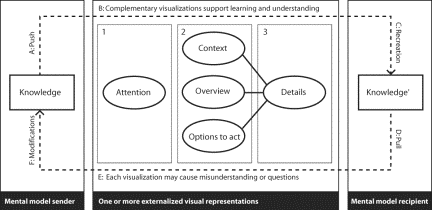
1 Examples: Asymptote Architecture (www.asymptote-architecture.com), Morphosis (www.morphosis.net), MVRDV (http://www.mvrdv.archined.nl), The Office for Metropolitan Architecture OMA with its research department AMO (www.oma.nl), Eisenman Architects, (www.eisenmanarchitects.com) or the UN Studio (www.unstudio.com). Page 481 They illustrate both overview and detail, and interrelationships among these details. Thus Knowledge Maps are graphic directories of knowledge-sources, -assets, -structures, or -processes. However, Knowledge Maps can also be fictitious and address visions, or Stories, for example to establish a mutual context in an organization. For the transfer and creation of knowledge, Maps help to present the overview and the details, to structure information, to motivate and activate employees, to establish a common Story, and to ease access to information. Images are impressive, expressive, or represent reality. Images address emotions and they are inspiring, appealing, motivating, and energizing. Therefore, they are widely used as a key instrument in Advertising. Images can be grasped and recalled in less than a second and sometimes be remembered for decades (i.e., key-images of the war in Vietnam or Iraq). The same effects can be used for the transfer of business related knowledge, e.g., by using Visual Metaphors. Visual Metaphors support remembrance, lead to A-ha effects, support reasoning, and communication. They are instant, rapid and highly instructive, and facilitate learning. For the transfer of knowledge, Images help to get the attention (e.g., Advertising), inspire recipients (e.g., art), address emotions (e.g., Advertising), improve recall (i.e., signs, Visual Metaphors), or initiate discussion (e.g., satirical comic). Objects exploit the third dimension and allow experiencing materials. Objects in space are helpful for example for information points, knowledge fairs, or exhibitions to complement physical and digital visualizations and to show the content from different points of view. For the transfer of knowledge, Objects help to attract recipients, support learning through constant presence, or allow to integrate digital interfaces. Interactive Visualizations allow to access, explore, and make sense of different types of information. This is the domain of Interaction Design and Information Visualization applications. An elaborated example of such an Information Visualization application is described in [Brodbeck and Girardin 2003]. Another application, the Infoticle application [Vande Moere et al., 2004], uses data-driven particles (Infoticles) to explore large time-varying datasets with reoccurring data objects that alter in time in an immersive environment. Animating these Infoticles leads to an animation that allows to see the behaviour of individual data entries or the global context of the whole dataset. For the transfer of knowledge, interactive visualizations help to fascinate people, enable interactive collaboration across time and space, allow to represent and explore complex data, or to create new insights. Stories, the last visualization type, are imaginary (i.e., not physical) visualizations that are efficient in transferring and disseminating knowledge across time and space. The use of Stories, called Storytelling, allows to transport an illustrative mental image by the use of spoken or written language and can be used in organizational practice [Loebbert, 2003]. Page 482 To transfer knowledge, imaginary visualizations complement the other six visual formats and are valuable to establish a shared vision, a Mutual Story, to motivate and activate individuals. All together this section introduced the four relevant perspectives that need to be considered when one is concerned in successful visual knowledge transfer: A Function Type Perspective answers why a visualization should be used, a Knowledge Type Perspective clarifies the nature of the content, a Recipient Type Perspective points to the different backgrounds of the recipient/audience, and finally the Visualization Type Perspective differs seven main visualization types according to their individual characteristics. Next we discuss a model that identifies and relates the necessary elements which must be considered for a successful transfer of knowledge. 5 Knowledge Visualization ModelChoosing the right visual format demands skills and experience. But, a general model for Knowledge Visualization helps to assist practitioners and to mediate among researchers from different fields. Such a model identifies and relates the features that contribute most to a successful behavior when visual representations are used to transfer and create knowledge. Such a model is needed for three reasons: First, Communication Sciences models [Lasswell, 1948; Shannon and Weaver, 1949; Newcomb, 1953; Gerbner, 1956; Jakobson, 1960] are too general with regard to the use of visual representations. Second, Visualization Scientists do not offer a holistic model for the transfer and creation of knowledge with visual representations. Third, the model complements the Knowledge Visualization Framework and together can achieve the goals of Knowledge Visualization discussed above. We call this missing model the Knowledge Visualization Model. It is described next. 5.1 The Knowledge Visualization ModelThe Knowledge Visualization Model (Figure 3) is divided into three parts: a sender, a medium, and a recipient. These three parts are all interlinked in an interaction and communication loop and discussed in [Burkhard 2005]. The model describes inter- and intrapersonal iterative processes: The process starts with a sender who wants to transfer some of his knowledge (knowledge) to a recipient (A). His mental model of this knowledge (mental model sender) is being externalized into various explicit and complementary visual representations (B), which can be divided into three sub-processes (1,2,3) following a temporal sequence: First, the sender needs to get the attention (1) of the recipient, for instance by using a provocative image. Second, the sender needs to illustrate the context (2), provide overview (2), and present options to act (2). Only then the sender can point to selected details (3), which ideally happens in a dynamic dialog with the recipient (D), who re-constructs (C) similar knowledge (Knowledge') based on these complementary visualizations an own mental image (mental model recipient). But due to different assumptions, believes, or backgrounds inferences and misinterpretations can occur (E), which may lead to a failure of the knowledge re-construction. Then, the sender iteratively refines or adds further visual representations (F), until the knowledge transfer process is successful. Page 483 Figure 3: The Knowledge Visualization Model with a sender, a recipient and complementary visualizations as a medium. The model introduces the salient features that need to be considered when complementary visual representations are used to transfer or create knowledge. Next we discuss guidelines for using the framework. 5.2 GuidelinesWhen applying the model several guidelines may be considered. They are discussed in this section. First, a designer needs to understand and assess the quality of the information and check whether the information is complete, reliable, and relevant for the recipient who is being addressed. Then he should concentrate on the social, cultural, and educational background of the recipient and know his personal or functional needs. Then the designer should address the context and present both overview and detail on the information, and ideally options to act - options for how the knowledge can be applied. By doing so the visualization should be compressed to the core messages or contents and be consistent. Consistent in regard to the logic, the way to interact with it (e.g., in interactive applications), and to the use of visual elements. Elements such as color, shape, size, symbols, or fonts should be similar for similar types of data in all visualizations. By doing so it is important to prevent potential misinterpretation, misuse, or misunderstanding: In ambiguous situations text should help to clarify the message and decorations or the unnecessary use of elements such as clip-arts or strong colors should be avoided because they may distract the audience. In motivational tasks visual representations should be designed to cause thinking, and to encourage users to elaborate own knowledge. To do so, imaginary visual representations help to disseminate and establish a shared vision. After discussing the general guidelines the model is applied in one Knowledge Visualization application. Page 484 6 Tube Map Visualization: A Visual Metaphor for Interfunctional Communication of ProjectsIn an education center for health care professions a complex quality development process has to be communicated to different target groups. Understanding and motivation among all employees are important to achieve the quality certification. The involved employees have different functions and backgrounds, so their information need diverges: Some employees need to know details, some suffer from an information overload. This situation makes it difficult to communicate the appropriate amount of information and lead to different questions.
From our professional experience in visual Knowledge Communication we believe that successful implementations are tailored to the target users' experience and to the nature of the information need. The tube system (subway system) seems to be a promising metaphor: (1) because it implies a dynamic and complex system where unpredictable occurrences can happen, (2) because the tube system helps people to reach their targets, (3) because the tube map is appealing and fascinating for urban people, (4) because it presents both overview and detail in one image, (5) because it structures the information and enables to zoom in to details on demand. The tube system has been adapted to the process: Each tube line represents one target group, each station represents an individual or collective milestone, as seen in Figure 4 and 5. The map has been drawn with the software Adobe Illustrator 10 2 and has been refined in several meetings. Initially we were thinking about computational procedures that generate the tube map. But we decided to draw the tube map manually because it helped optimising the aesthetic value which is essential to get the attention. The poster has been made in three iterative steps. In three meetings the management board has made corrections and added further information on the full scale printouts. Full scale printouts have been used so that the managers could easily imagine the final map. After each meeting we have transferred the corrections to a meaningful new version of the map. The final poster has been displayed at prominent locations, similar to Figure 6, which illustrates another Tube Map Visualization application in another organization (Figure 6).
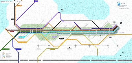
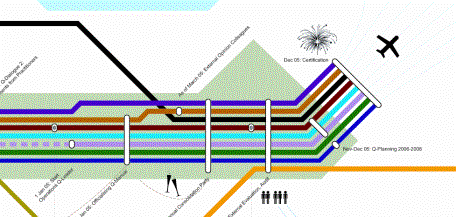
2 http://www.adobe.com Page 485 Figure 4: The Tube Map Visualization (1,2 x 2,4 meter) presents overview and detail on a three year quality development process. Each tube line represents one target group, each station a project milestone. The quality certification is the mutual goal of the project. It starts at the left side (2001) and ends at the right side (2005). Figure 5: Zoom-In with collective and target-group specific milestones (stations). Each tube line (target group) stops at the stations (milestones) where the target groups are involved. The stations are tagged with descriptions and a date, so that the employees get detailed information and instructions. Page 486 Figure 6: The Tube Map Visualization of another complex project that had to be communicated to different stakeholders. The Tube Map Visualization is located next to the elevator and fosters discussions. Positive feedback from the employees has encouraged us to evaluate the effectiveness of the Tube Map Visualization. The evaluation and the findings are discussed in the next section. 7 Evaluation: Methodology and Results7.1 HypothesisThe hypothesis we tested is: The Tube Map Visualization is an effective method for communicating a complex project to different stakeholders. Several assumptions have been evaluated:
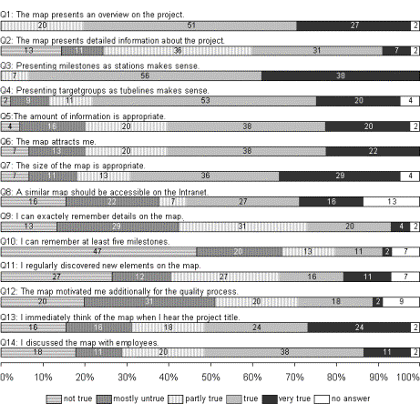
7.2 Target groupThe target group has consisted of all employees whom the Tube Map Visualization addressed; in total 81 persons. The employees have different educational backgrounds. Most of them have diplomas in the area of health care professions. Page 487 7.3 MethodTwo months after the Tube Map Visualization had been made public, a paper based customized questionnaire has been distributed to the 81 employees. The questionnaire consists of two parts: Questions to the Tube Map Visualization and general questions (as age, background or education). Comments could be added to each question. At the end of the questionnaire, it is asked, what the participants like and dislike the most. The participation has been voluntary and anonymous. The original questions are asked in German. For this publication the questions are translated into English, as seen in Figure 7. 7.4 Response45 out of 81 questionnaires have returned (response rate = 0,56). 62 percent of the population is female, 29 percent male and 9 percent haven't answered the question to its gender. One person has a university degree. 76 percent have a diploma in the health care sector that is accepted by the Swiss Red Cross. 23 percent have a higher education similar to a university degree 3. 76 percent is between 31 and 50 years old. The average time they are employed in the education center is 6.2 years. 8 ResultsFigure 7 presents the results from the questions concerning the Tube Map Visualization. 8.1 PositiveAttention: Each person has seen and studied the Tube Map Visualization. Each participant could answer all questions on the questionnaire. Overview: The visualization helped the employees to get the missing overview on the project. Several employees have made written comments that they could grasp the whole project and that the Tube Map Visualization gives them orientation. The feeling of uncertainty is transferred to interest and motivation. 78 percent of the participants states that the tube map gives them overview, (Q1: 51 percent = true, 27 percent = very true). Details on demand: The employees consider the amount of information appropriate. However, the comments show that for some users there is too much, for others not enough information. Question 2 and comments for question 2 show that the employees wish further information. The tube map motivates people to get further information. The results show that the amount of data needs special attention and further investigations.
3 In German: "Fachhochschulabschluss" Page 488 Figure 7: The results of the questionnaire. The numbers in the bars represent per cent. (n=45). Strong metaphor: The employees understand the metaphor. Meanwhile the tube map is a synonym for the quality development process. The results of the questions 3 and 4 show that presenting milestones as stations and target groups as tube lines makes sense for the employees. The employees like the visualization. According to Question 6, 60 percent of the participants are attracted (38 percent = true) or very attracted (22 percent = very true) by the Tube Map Visualization. 66 percent say (24 percent = very true, 22 percent = true) that they immediately think of the tube map, when they hear the title of the project. (In a meeting ten months after the questionnaire, feedbacks from employees have considered this effect even as stronger.) Motivation: The feedback from the interviews with the management board showed that the Tube Map Visualization has been motivating the employees to study the project more deeply. 40 percent (Q13: 2 percent = very true, 18 percent = true, 20 percent = partly true) claim that the Tube Map Visualization motivates them additionally for the project. Page 489 Discussion: The location and size of the poster have fostered discussion - with colleagues and at home. The tube map metaphor has established a mutual story for the quality development process. Learning: Even if it hasn't been a task that the employees remember dates in detail, we are interested whether the employees remember detail. 46 percent of the participants say that they remember milestones (Question 10). However, we haven't verified, if the dates are correct. 8.2 NegativeAttention: Three employees consider the visualization as too predominant. Overview: The comments of two participants say, that initially they were confused by the metaphor. But interestingly no-one is distracted by the linear structure of the tube map due to the mapping of the linear timeline. Details on demand: The right amount of information to be presented remains the key issue. Few people desire more detailed information to the individual milestones. Motivation: Further studies with two focus groups have to be made to give answers how the Tube Map Visualization supports learning. Discussion: Only 27 percent of the participants states, that they have discussed on the tube map in their spare time or at home. Learning: Further studies with two focus groups have to be made to give answers how the tube map supports learning. 8.3 DiscussionThe evaluation proves that the Tube Map Visualization is an effective tool for interfunctional communication of a complex project and complements Gantt Charts. However, the static posters are not suitable if major changes and modifications occur in the future. We consider an interactive map as an additional tool on the intranet as a useful option to offer detailed information on selective milestones. The results illustrate, that 42 percent of the participants states that a similar map should be accessible on the intranet (Q8: 27 percent = true, 16 percent = very true). We currently test whether the process of creating a map can be automated by a software. Face-to-face meetings with the persons involved in the management board have shown that the Tube Map Visualization is a useful tool to coordinate the management board and to unify them on the contents. The main disadvantage is that the printed posters are static and that major changes are difficult to update. 9 ConclusionThis article introduced a new visualization method and an evaluation of its implementation in a quality development process in an organization. Summary: First, we introduced a theoretical framework and a model for Knowledge Visualization. The framework and the model identify and relate the key-aspects for successful Knowledge Visualization applications. Next, we discussed and evaluated a Knowledge Visualization application. Page 490 A complex project had to be communicated to employees in an education centre for health care professions. Traditional visualization did not succeed. We adapted the metaphor of a tube map to illustrate the project. Each tube line represented a target group. The stations represented milestones. The Tube Map Visualization, printed on posters, enabled to get the attention, to give overview and to motivate the employees to act. An evaluation verified our hypothesis: It proved that the Tube Map Visualization attracts the employees, presents overview, and establishes a Mutual Story. The visualization further fosters discussion and supports understanding. The evaluation made clear that the Tube Map Visualization is a powerful metaphor for the interfunctional communication of a complex project. The main weakness is that the printed posters are static and difficult to update. Individual interviews with the management board further showed that the process of creating the map is effective to unify the management board, which as a result improves the general information and communication quality. Contributions: This article presented both a theoretical framework and a model and introduced the Tube Map Visualization application. All together these contributions highlight the cognitive, social, and emotional benefits of visualizations for the transfer of knowledge. The main benefits are: (1) Visual representations help to coordinate individuals and initiate discussion. (2) They allow to get and keep the attention of individuals. (3) They improve memorability, remembrance, and recall. (4) They inspire, motivate, energize, and activate recipients. (5) They lead to further understanding and deeper insight, as one interacts with them. (6) They can reveal previously hidden relationships and lead to new insights or A-ha experiences. Drawbacks: Visualizations can have drawbacks with regard to specific contexts. One main disadvantage is the time and cost that are needed for professional visualizations and the difficult maintenance. Another disadvantage is misinterpretation or manipulation of recipients. Future research will have to investigate these potential negative effects empirically in authentic application contexts. Five main drawbacks are discussed in [Eppler and Burkhard 2005]. (1) They can lead to confusion, (2) they can lead to an overload or oversimplification, (3) they can lead to misuse or misrepresentation, (4) the can be used for manipulation, or (5) they can be ambiguous in their meanings. Trends: Knowledge Visualization will evolve with regard to new formats and new application areas. The potential to combine various formats (such as Diagrams, Maps, and Visual Metaphors) in a complementary way (as architects use them) seems obvious. It also seems clear that Knowledge Visualization will be used in other settings than just the traditional computer desktop environment. Examples of new application areas for Knowledge Visualization can be found, for example, in the visual communication of corporate missions, strategies, value propositions, and business scenarios. New applications can also be envisioned by combining Knowledge Visualization with other innovative approaches in Knowledge Management, such as Storytelling. Storytelling is in fact a closely related Knowledge Management tool, as it strives for rich, mental imagery [Loebbert, 2003]. We believe that Stories can be combined with Knowledge Visualization formats to trigger and accelerate the creation and dissemination of knowledge in organizations. Page 491 In conclusion, we believe that additional time and budget for Knowledge Visualization should be allocated in future corporate Knowledge Management initiatives and in future research initiatives on Knowledge Management. Knowledge Visualization clearly is an idea whose time has come. To put this idea into practice, however, still requires great efforts. 10 Future WorkIn our future studies we will make further evaluations. First, we want to find out the acceptance of interactive computer based maps. Second, we want to make comparisons with traditional project plans (i.e. Microsoft Project) and the Tube Map Visualization. Third, we want to find out more on the appropriate amount of information on the tube map. Finally, we want to test, whether the tube map can be created with a computational algorithm. References[Alavi, M. and Leidner, D., 2001] Alavi, M. and Leidner, D.: "Knowledge Management and Knowledge Management Systems: Conceptual Foundations and Research Issues"; MIS Quarterly, 25, 1 (2001), 107-136. [Bauer, M. and Johnson-Laird, P., 1993] Bauer, M. and Johnson-Laird, P.: "How Diagrams Can Improve Reasoning"; Psychological Science, 4, 6 (1993), 372-378. [Bertin, J., 1974] Bertin, J.: "Graphische Semiologie. Diagramme, Netze, Karten"; Walter de Gruyter, Berlin (1974) [Brodbeck, D. and Girardin, L., 2003] Brodbeck, D. and Girardin, L.: "Design Study: Using Multiple Coordinated Views to Analyze Geo-Referenced High-Dimensional Datasets"; CMV 2003, London, (2003). [Bruner, J. S., 1957] Bruner, J. S.: "On Perceptual Readiness"; Psychological Review, 64, 123-152 (1957). [Burkhard, R., 2004] Burkhard, R.: "Learning from Architects: The Difference between Knowledge Visualization and Information Visualization"; Eight International Conference on Information Visualization (IV04), London, July, (2004). [Burkhard, R., 2005] Burkhard, R.: "Towards a Framework and a Model for Knowledge Visualization: Synergies between Information and Knowledge Visualization"; Knowledge and Information Visualization: Searching for Synergies. Tergan, S.-O. and Keller, T. Springer Lecture Notes in Computer Science, Heidelberg / New York (2005) [to appear]. [Card, S. K., Mackinlay, J. D. and Shneiderman, B., 1999] Card, S. K., Mackinlay, J. D. and Shneiderman, B.: "Readings in Information Visualization: Using Vision to Think", Morgan Kaufmann Publishers Inc., San Francisco (CA): 686.(1999) [Chen, C., 1999] Chen, C.: "Information Visualisation and Virtual Environments"; Springer-Verlag, London (1999) [Ellis, W. D., 1938] Ellis, W. D.: "A Source Book of Gestalt Psychology"; Harcourt, Brace & World, New York (1938) Page 492 [Eppler, M. and Burkhard, R., 2005] Eppler, M. and Burkhard, R.: "Knowledge Visualization"; Encyclopedia of Knowledge Management. Idea Group (2005) [to appear]. [Eppler, M. J., 2003] Eppler, M. J.: "The Image of Insight: The Use of Visual Metaphors in the Communication of Knowledge"; Proceedings of I-KNOW '03, Graz, Austria, July 2-4, (2003), 81-88. [Farah, M. J., 2000] Farah, M. J.: "The Cognitive Neuroscience of Vision"; Blackwell Publishers, Oxford (2000) [Fiske, J., 1982] Fiske, J.: "Communication Theory"; Introduction to Communication Studies. Fiske, J. Routledge, London (1982): 6-24. [Garland, K., 1979] Garland, K.: "Some General Characteristics Present in Diagrams Denoting Activity, Event and Relationship"; Information Design Journal, 1, 1 (1979), 15-22. [Gerbner, G., 1956] Gerbner, G.: "Toward a General Model of Communication"; Audio Visual Communication Review, 3 (1956), 171-199. [Glenberg, A. M. and Langston, W. E., 1992] Glenberg, A. M. and Langston, W. E.: "Comprehension of Illustrated Text: Pictures Help to Build Mental Models"; Journal of Memory and Language, 31, 2 (1992), 129-151. [Goldstein, B. E., 2001] Goldstein, B. E.: "Sensation and Perception"; Cole Publishing (6th edition), Pacific Grove (2001) [Gregory, R. L., 1980] Gregory, R. L.: "Perceptions as Hypotheses"; Philosophical Transactions of the Royal Society of London, Series B, 290 (1980), 181-197. [Gregory, R. L., 1998] Gregory, R. L.: "Eye and Brain. The Psychology of Seeing (5th Edition)"; Princeton University Press, Princeton, New Jersey (1998) [Horn, R. E., 1998] Horn, R. E.: "Visual Language: Global Communication for the 21st Century"; MacroVU Press, Bainbridge Island (WA) (1998) [Jakobson, R., 1960] Jakobson, R.: "Closing Statement: Linguistics and Poetics"; Style in Language. Sebeok, T. The MIT Press, Cambridge, Mass. (1960): 350-377. [Johnson, B. and Shneiderman, B., 1991] Johnson, B. and Shneiderman, B.: "Tree-Maps: A Space Filling Approach to the Visualization of Hierarchical Information Structures." Proc. of the IEEE Visualization '91, San Diego, CA, (1991), 284-291. [Koffka, K., 1935] Koffka, K.: "The Principles of Gestalt Psychology"; Lund Humphries, London (1935) [Kosslyn, S. M., 1980] Kosslyn, S. M.: "Image and Mind"; Harvard University Press, Cambridge (MA) (1980) [Larkin, J. and Simon, H., 1987] Larkin, J. and Simon, H.: "Why a Diagram Is (Sometimes) Worth Ten Thousand Words"; Cognitive Science, 11 (1987), 65-99. [Lasswell, H., 1948] Lasswell, H.: "The Structure and Function of Communication in Society"; The Communication of Ideas. Bryson, L. Institute for Religious and Social Studies, New York (1948): 37-51. [Loebbert, M., 2003] Loebbert, M.: "Storymanagement : Der Narrative Ansatz Für Management Und Beratung"; Klett-Cotta-Verlag, Stuttgart (2003) [Mandl, H. and Levin, J. R., 1989] Mandl, H. and Levin, J. R.: "Knowledge Acquisition from Text and Pictures", Advances in Psychology, North-Holland, Amsterdam, 58: 329.(1989) Page 493 [Miller, G. A., 1956] Miller, G. A.: "The Magical Number Seven, Plus or Minus Two: Some Limits on Our Capacity for Processing Information"; The Psychological Review, 63 (1956), 81-97. [Munzner, T., 1998] Munzner, T.: "Exploring Large Graphs in 3d Hyperbolic Space"; IEEE Computer Graphics and Applications, 18, 4 (1998), 18-23. [Newcomb, T., 1953] Newcomb, T.: "An Approach to the Study of Communication Acts'"; Psychological Review, 60 (1953), 393-40. [Nonaka, I., 1991] Nonaka, I.: "The Knowledge-Creating Company"; Harvard Business Review, 69, 6 (1991), 96-104. [Novick, L. R., 2001] Novick, L. R.: "Spatial Diagrams: Key Instruments in the Toolbox for Thought"; The psychology of learning and motivation, 40 (2001), 279-325. [Robertson, G. and Mackinlay, J. D., 1991] Robertson, G. and Mackinlay, J. D.: "Cone Trees: Animated 3d Visualizations of Hierarchical Information"; Proc. of ACM SIGCHI conference on Human Factors in Computing Systems '91, New Orleans, LA., (1991), 189-194. [Rock, I., 1983] Rock, I.: "The Logic of Perception"; MIT Press, Cambridge, MA (1983) [Shannon, C. and Weaver, W., 1949] Shannon, C. and Weaver, W.: "The Mathematical Theory of Communication"; University of Illinois Press, Illinois (1949) [Shepard, R. N. and Cooper, L. A., 1982] Shepard, R. N. and Cooper, L. A.: "Mental Images and Their Transformations"; MIT Press, Cambridge (MA) (1982) [Shneiderman, B., 1992] Shneiderman, B.: "Tree Visualization with Tree-Maps: A 2-D Space-Filling Approach"; ACM Transactions on Computer Graphics, 11, 1 (1992), 92-99. [Shneiderman, B., 1996] Shneiderman, B.: "The Eyes Have It: A Task by Data Type Taxonomy for Information Visualizations"; Proceedings of 1996 IEEE Visual Languages, IEEE, Los Alamos, CA, (1996), 336-343. [Spence, B., 2000] Spence, B.: "Information Visualization"; ACM Press (2000) [Tufte, E. R., 1990] Tufte, E. R.: "Envisioning Information"; Graphics Press, Cheshire (CT) (1990) [Tufte, E. R., 1997] Tufte, E. R.: "Visual Explanations: Images and Quantities, Evidence and Narrative"; Graphics Press, Cheshire (CT) (1997) [Ungerleider, L. G. and Mishkin, M., 1982] Ungerleider, L. G. and Mishkin, M.: "Two Cortical Visual Systems"; Analysis of Visual Behavior. Ingle, D. J., Goodale, M. A. and Mansfield, R. J. W. MIT Press, Cambridge (1982): 549-586. [Vande Moere, A., Mieusset, K. H. and Gross, M., 2004] Vande Moere, A., Mieusset, K. H. and Gross, M.: "Visualizing Abstract Information Using Motion Properties of Data-Driven Particles"; Conference on Visualization and Data Analysis 2004, IS&T/SPIE Symposium on Electronic Imaging 2004, San Jose (CA), (2004). [Ware, C., 2000] Ware, C.: "Information Visualization: Perception for Design"; Morgan Kaufmann, San Francisco (CA) (2000) [Weidenmann, B., 1989] Weidenmann, B.: "When Good Pictures Fail: An Information Processing Approach to the Effect of Illustration"; Knowledge Acquisition from Text and Pictures. Mandl, H. and Levin, J. R. Elsevier, Amsterdam (1989): 161-171. [Wurman, R. S., 1996] Wurman, R. S.: "Information Architects"; Graphis Inc, Zürich (1996) Page 494 |
|||||||||||||||||